Brenda Bianca Keevy

Digital Designer

Brenda Bianca Keevy

Digital Designer

Brenda Bianca Keevy

Digital Designer

Brenda Bianca Keevy

Digital Designer

Digital Acceptance

Mobile

Background

Upon joining the team, it was clear that the app faced significant challenges. The outdated design and clunky code made the interface confusing and unappealing to users. One of the main issues was inconsistent information between the app and web platforms. Recognising the need for improvement, we launched an optimisation project aimed at modernising the app and creating a unified experience.


Project Overview

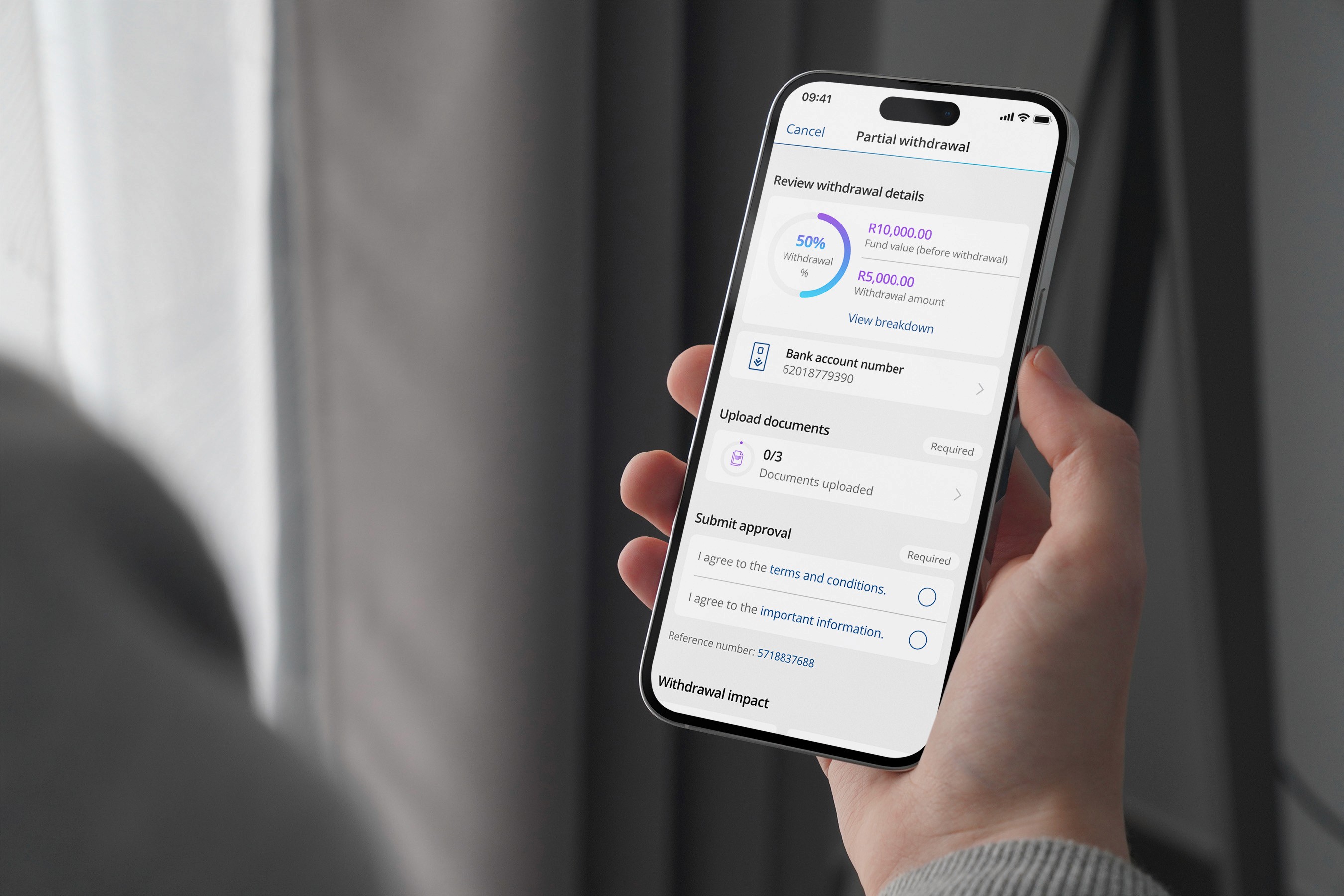
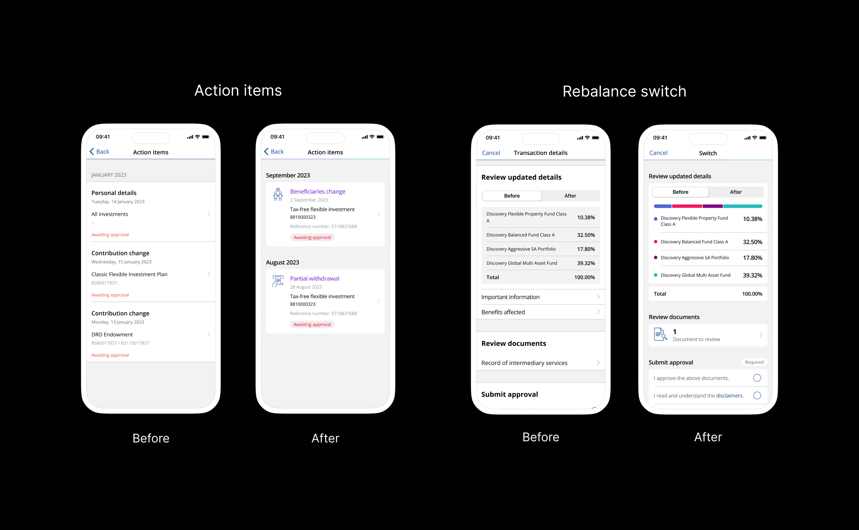
The optimisation project focused on modernising the app's UI language and enhancing brand consistency across the brands current platforms. The design overhaul began with iOS, introducing a sleek, card-based interface inspired by the iOS16 software update. This modern design extended to Android, ensuring a cohesive user experience across both platforms. Although the project didn’t reach production, it set the stage for future improvements and emphasised the importance of user-centric design and consistent branding.

Roles & Responsibilities
  • Collaborated with the design lead to define and prioritise features based on feedback and business goals.

  • Created user flows to ensure a smooth and engaging user experience

  • Co-facilitated cross-functional workshops and design sprints to encourage collaboration and innovation.

  • Developed user personas and journey maps to better understand user needs and pain points

  • Designed wireframes, mockups, and high-fidelity prototypes for a refreshed app interface

  • Updated the app's visual design, incorporating modern trends while maintaining brand consistency


Challenges

One of the key challenges was designing a seamless experience for both iOS and Android users. Each platform presented its own set of guidelines and user expectations, which required a thoughtful approach to maintain a consistent design language without compromising the user experience on either platform. Through iterative design and user testing, we were able to address these challenges effectively. Another consideration was ensuring that new design elements integrated smoothly with existing features that had yet to adopt the updated UI. Balancing these updates while maintaining a cohesive experience across the app was key to ensuring a successful design evolution.


Impact & Learnings

Throughout the project, the focus on modernising the app and aligning it with current design trends significantly enhanced the user experience. By collaborating across teams and prioritising user feedback, we delivered a design that was not only visually appealing but also functional and user-friendly. The lessons learned from working across iOS and Android platforms helped refine my design approach, particularly in ensuring consistency while catering to the unique requirements of each operating system. This project provided a solid foundation for future design improvements and reaffirmed the value of user-centered design principles.

Before and after
Before and after
Before and after
Before and after